HOW TO COLOR A COMIC IN PHOTOSHOP -Pt. 2 FLATTING COLORS
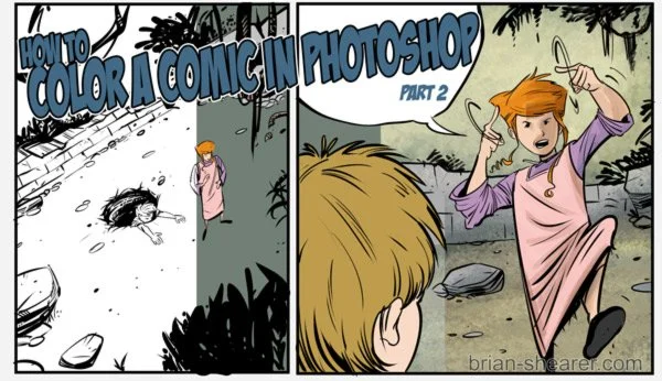
HOW TO COLOR A COMIC IN PHOTOSHOP – FLATTING COLORS
Last time I showed how I scan in artwork and get the layers set up in Photoshop for coloring. This time we’re going to go over flatting-in colors.
Your layers should look like this (Note: You can rename your layers by double-clicking on the current name. For example, changing “layer 0” to “lineart.”)

Now that we’re set up, let’s move on to actually coloring.
1) SETTING UP THE BASE COLOR FILL
Instead of coloring in bits and pieces on a blank white background, select an overall fill color to begin with. Is your scene at night? Maybe use a darker bluish hue. Forest? Lay down a green or greenish-yellow. Maybe a brown. It just depends on the mood and atmosphere you’re going for. Here I used a green for the base color since they’re around a lot of trees and plants.
Just use the paint bucket tool and the whole page should fill up with your color.
From here I like delete the color that’s in the gutters (the area between panels) Use the MAGIC WAND tool and make sure to click the box marked CONTIGUOUS.

Contiguous will only select the area of color you click on — stopping wherever that color stops. This will be important later when we start looking at shadows and highlights. To select the gutters, click on the layer that has your line art and click on an area anywhere in the gutter. Then click back on the coloring layer.
Hit DELETE to delete the color in the gutters.
So at this point your page looks something like this:

2) SELECTING AREAS AND FILLING
Now to start separating everything that needs to be a color other than the background hue you just laid down. Meet your friend, Mr. Polygonal Lasso.
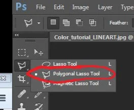
There are three different lasso options. This is the one that I’d recommend for right now. But, of course, experiment to see what works for you. This will let you select the areas, like faces and clothes, that need to be separate from each other.
TIP: Click and hold the icon to display the variations of any tool in the Photoshop toolbar.
Let’s start with Ella’s face here.

Just follow the outline of her face (where you want the skin tone to stop.) Every time you click, a new anchor point is laid down and you can change directions. Just don’t click too fast between points, or it’ll close the selection before you’re ready.
Once you’ve come all the way around, just click the place you started and boom! You have an area ready to be filled in.
Just the Keyboard shortcuts L (for Lasso) and G (for, uh, Paint Bucket) to quickly go back and forth selecting areas and filling them in.

I usually choose a mid-tone for my flat colors. That way I have someplace to go with shadows and someplace to go for highlights. But honestly at this point the main thing is separating the different areas. You could separate them all in crazy colors and go back later and decide what everything needs to be. Whatever you feel like doing.
Note: A good resource on coloring is the DC Comics Guide to Coloring and Lettering. Even if you’re not doing superhero books, there are good principles laid out there.*
A good thing to keep in mind is where everything sits in terms of foreground, middle ground, and background. That’s probably a subject for another blog since I’m just covering the basic mechanics of how to color in Photoshop, but thinking through where everything sits will give your image more depth.
For example, if something is right up front in the panel, but the focal point is mid-ground, you could (and I often do) make it a blue shadowy hue–or whatever color you choose, just make sure the color itself doesn’t distract from the main subject. Red probably isn’t good. In fact, I’d recommend a cool color like blue or green. But I’ll save that for later.
Once you’ve gone all through each panel separating the elements, you’ll have something that should look like this:

Note: I’ve started doing a lot of background stuff with the shadow and highlight layers, sometimes “painting” in the bg elements. You can flat as much as you need to for your style. You get the idea.
Depending on the lineart, you may even want to stop here. I just depends on what you’re going for. My style on this particular page needs more I think, so next time we’ll get in to shadows and highlights. See you then!
KEY POINTS
-USE THE LASSO TOOL TO SELECT (L)
-USE THE PAINTBUCKET TOOL TO FILL (G)
-ESTABLISH AN OVERALL MOOD/SCENE/LOCATION COLOR FIRST
-SEPARATE ANY AREA/ELEMENT THAT NEEDS IT’SOWN COLOR.
-TRY TO STICK TO MID-TONES