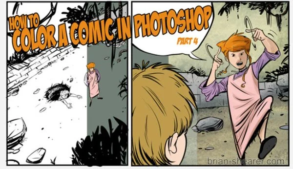
HOW TO COLOR A COMIC IN PHOTOSHOP – Pt. 4 COLOR AND TEXTURE OVERLAYS
HOW TO COLOR A COMIC IN PHOTOSHOP – COLOR AND TEXTURE OVERLAYS
WHAT IS AN OVERLAY?
An overlay in Photoshop can help add a little extra to your colors. Two ways to achieve this are through either a texture or color overlay that can help unify the page. You don’t have to do this. I just include it here because it’s what I do and it works for me. I started doing it mainly by experimenting. At the very least, if you’re new to Photoshop it will help you get a feel for what layers are capable of.
As with the other layers we created for each step of coloring, we’ll need a new layer with a new Mode.
Let’s start with a texture overlay. I don’t always use a texture overlay, but I have been with my webcomic, William the Last. I find it adds a little to the page, so I’ve stuck with it. But first we need to find a texture.
Some ways to get a texture include:
Scan in a piece of paper/cardboard/wood/fabric or some other textured material.
Create a texture yourself in Photoshop
Find a texture online. Deviantart.com is a good resource, just be sure to read the what the creator of the texture stipulates for it’s use.
The texture I use for William the Last is the Blue Grunge Texture I downloaded from http://solstock.deviantart.com/ The stock there is free to use anywhere, but I sent a note out of courtesy, which is always a good idea. (For the record, The original file is blue. I converted it to grayscale so the color of the texture wouldn’t affect my colors. But you can do what you like.) Here’s the raw texture:
HOW TO USE A TEXTURE
In Photoshop, you should have 2 files open — the comic you’re working on and the texture you want to use.
Select the entire texture image (CTRL-A) and copy it (CTRL-C).
Go to the comic and click on the topmost layer.
Paste the texture you’ve just copied (CTRL-V).
You see nothing but the texture, so let’s change the mode of the texture layer to MULTIPLY.
Now you see the texture and the comic, but it’s really dark.
So let’s adjust the opacity of the texture.
Set the opacity to something low, like 20%. Just play with it until it looks good to you.
That’s all there is to it. Play with different textures until you get something you like! I like the effect of the texture to be subtle. You may not know it’s there until it’s missing. But it all depends on what your purpose is.
HOW TO USE A COLOR OVERLAY
Now let’s move on to a color overlay. I usually do this after I’ve finished all the flats and the texture and saved the file as a .tif.
Note: A .tif file is a high resolution format. Usually when uploading files for print, it’ll be a .tif format. And the file size usually isn’t too high.
Save your file as a .tif version. And then open up that file in Photoshop. What you’ll have is an image with just one layer. The .psd file is your master file for any further changes to the individual layers. The .tif file is a flattened image that you can do other things with like lettering or doing a color overlay. So let’s do that.
1) Add a new layer. Set the MODE to HUE and the Opacity to 25%
2) Select a color to use. You’ll have to experiment here too. I’ve been using a pinkish hue on William the Last, so let’s do that. Here’s the image before the hue:
3) Use the paint bucket to fill in the color on your new layer.
That’s all there is to it. The goal with this for me is to unify the colors under a slight hue. From here you can adjust the opacity, or select a new color and fill in that layer to see how it affects the overall image.
Also play with other MODE settings like Color, Overlay (yes, there’s an overlay mode, but I don’t usually use it to, well, overlay. But you can.) or any of the other options. Find out what works for you. Experiment! Play!
Well, that wraps up this series on how to color a comic in Photoshop. I hope it helps!


